smargins Quickstart Guide
2017-12-06
Workflow overview
Models in R can generally be fit using a formula interface. The fitted models can then be explored and post-processed in various was, for example to display an ANOVA-style table, calculate confidence intervals, or plot predictions from the model. This package provides additional post-estimation functions to calculate expected values along with simulation-based estimates of uncertainty.
Examples
Let’s walk through an example. This example uses the Prestige dataset. It contains data on 102 occupations. We will model the effect of education and type on income.
Building Models
Since income is a continuous variable, least squares is an appropriate model choice. To estimate our model, we call the lm function:
# load data
options(StringsAsFactors = FALSE)
data(Prestige, package = "car")

Prestige <- na.omit(Prestige)

# estimate ls model
m1 <- lm(income ~ education + type, data = Prestige)

# model summary
summary(m1)
##
## Call:
## lm(formula = income ~ education + type, data = Prestige)
##
## Residuals:
## Min 1Q Median 3Q Max
## -6242.7 -1768.0 -408.3 1149.1 16939.3
##
## Coefficients:
## Estimate Std. Error t value Pr(>|t|)
## (Intercept) -2048.2 2431.5 -0.842 0.40171
## education 887.9 284.7 3.119 0.00241 **
## typeprof 102.1 1805.3 0.057 0.95501
## typewc -2685.8 1140.5 -2.355 0.02061 *
## ---
## Signif. codes: 0 '***' 0.001 '**' 0.01 '*' 0.05 '.' 0.1 ' ' 1
##
## Residual standard error: 3312 on 94 degrees of freedom
## Multiple R-squared: 0.4052, Adjusted R-squared: 0.3862
## F-statistic: 21.35 on 3 and 94 DF, p-value: 1.249e-10Since this is an ordinary least squares regression, the coefficients are themselves quantities of interest. The education coefficient tells us that (holding occupation type constant) every additional year of education is associated with an $887.9 increase in income. The coefficients for typeprof and typewc are slightly more difficult to interpret. They are dummy codes that tell us the expected difference between blue-collar and professional incomes, and between blue-collar and white-collar incomes.
Although the model coefficients are not difficult to interpret, expected values are even more straight-forward. We can calculate them using the smargins function.
library(smargins)

ppred1 <- smargins(m1, type = unique(type))

ppred1
## type .sim_number .smargin_qi
## 1 prof 1 7924.766
## 2 prof 2 8185.379
## 3 prof 3 6451.597
## 4 prof 4 7425.381
## 5 prof 5 7411.770
## 6 prof 6 6695.249
## # - - - - - - - - - - - - - - - - -
## 14995 wc 4995 4050.739
## 14996 wc 4996 6131.891
## 14997 wc 4997 4503.442
## 14998 wc 4998 3597.820
## 14999 wc 4999 5699.268
## 15000 wc 5000 5169.789The print method shows us how the result is organized. There is a summary method that gives a default set of statistics for each combination of values specified in the at argument:
summary(ppred1)## type mean sd median lower_2.5 upper_97.5
## 1 prof 7639.212 1112.5612 7624.771 5471.654 9834.930
## 2 bc 7542.398 847.4511 7547.717 5821.903 9153.423
## 3 wc 4840.311 700.2960 4828.906 3483.344 6218.822Comparisons
The summary method shows expected values for each value specified in the ... arguments, but frequently we want some transformation of these values. There is a scompare function that gives pairwise differences:
summary(scompare(ppred1, "type"))## type mean sd median lower_2.5 upper_97.5
## 1 prof vs bc 2798.90120 1266.006 2785.93852 380.9055 5290.244
## 2 prof vs wc -96.81424 1797.696 -82.22986 -3648.5200 3429.564
## 3 bc vs wc 2702.08696 1149.508 2717.07318 462.2639 4888.239but the really great thing is that the structure is simple enough that the user can perform their own arbitrary transformations. For example, we can compare the average of white collar and professional with blue collar:
bc <- subset(ppred1, type == "bc")$.smargin_qi
wc_prof <- subset(ppred1, type == "wc")$.smargin_qi +
           subset(ppred1, type == "wc")$.smargin_qi
sumstats(bc - wc_prof)
## mean sd median lower_2.5 upper_97.5
## -2041.410 1717.267 -2063.545 -5284.473 1258.301Visualizations
Another advantage of the simple data structure returned by smargins is that it makes creating plots using standard graphics packages in R easy. For example, we can graph the expected values by type:
library(ggplot2)

ggplot(summary(ppred1),
       aes(x = mean, y = type)) +
    geom_point() +
    geom_errorbarh(aes(xmin = lower_2.5, xmax = upper_97.5),
                   height = 0.25)
ggplot(ppred1,
       aes(x = .smargin_qi)) +
    geom_density(aes(fill = type), alpha = 0.25)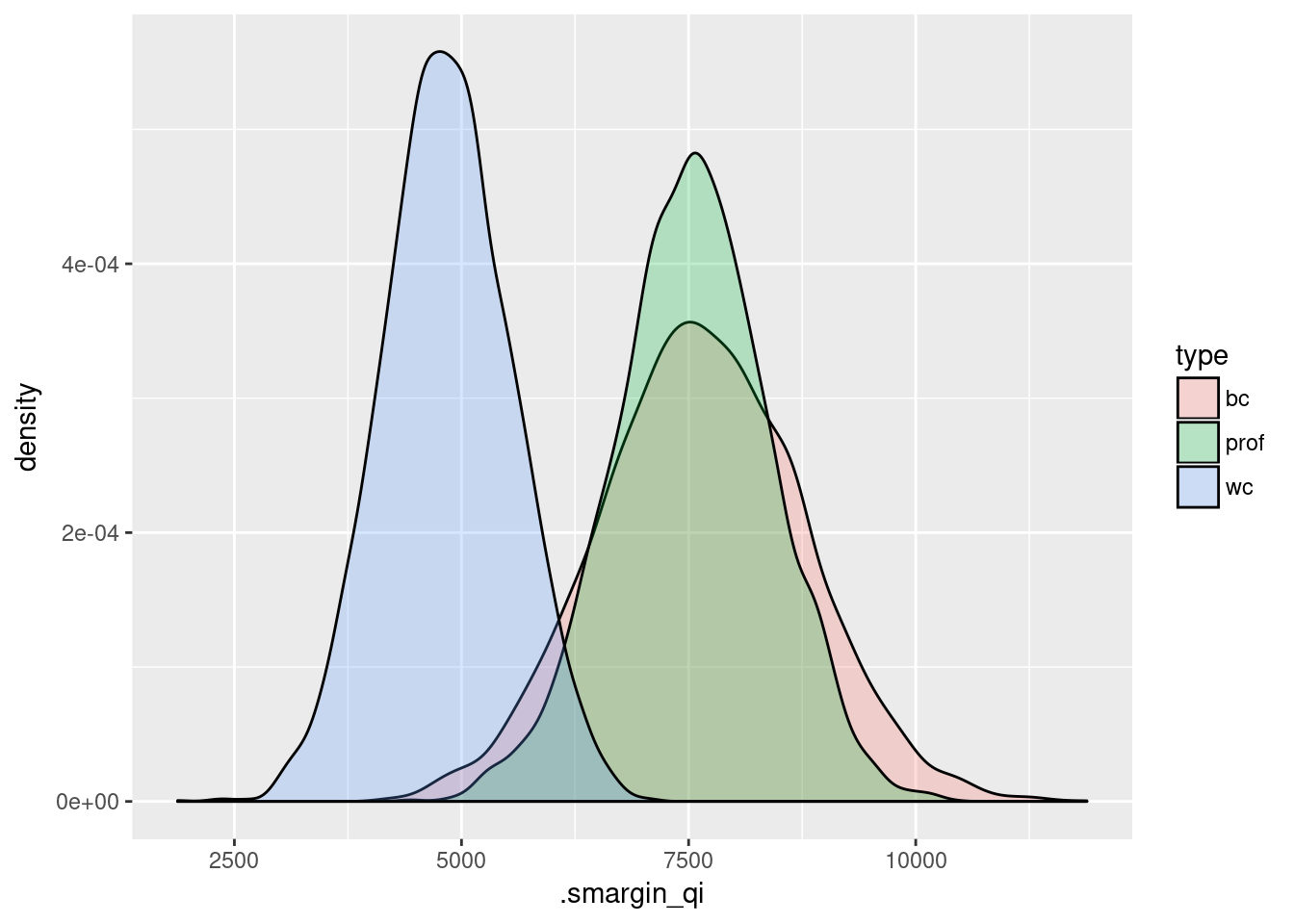
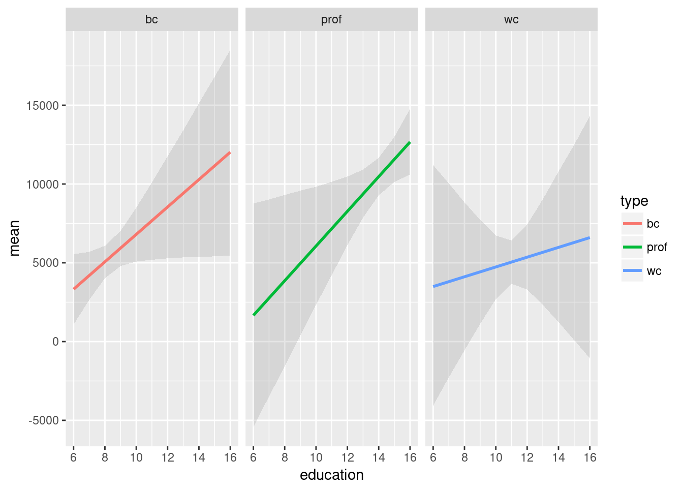
This is especially useful for plotting interactions:
m2 <- lm(income ~ education*type, data = Prestige)

m2.sm <- smargins(m2, education = 6:16, type = c("bc", "prof", "wc"))

ggplot(summary(m2.sm),
       aes(x = education, y = mean, color = type)) +
    geom_smooth(aes(ymin = lower_2.5, ymax = upper_97.5),
                stat = "identity",
                alpha = 0.25) + facet_wrap(~type)
## Warning: Ignoring unknown aesthetics: ymin, ymax